

I both dislike and like them. I like them in that they're simple, Canadian and the weird little pattern inside the maple leaf is First Nations artwork. Classy.
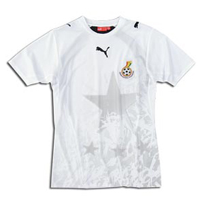 I dislike them because of the fact that THE CANADIAN HOCKEY FEDERATION LOGO IS STILL ON THE JERSEY, which you may remember being the problem in the first place. Secondly, while I like the idea of the First Nations artwork, I think it makes the maple leaf look sloppy. We should be embossing the artwork into the main body of the jersey, as Puma did during the 2006 World Cup (to the right is Ghana's jersey, Ghana's soccer team being known as the Black Stars).
EDIT -- Apparently the national federation logo is allowed to be on the jersey, it's just not allowed to be the main crest. That's why Sweden's jersey still has the circle with the ship in the top left corner. So I guess my only real problem with the jersey isn't actually a problem at all. That said, I think they would still look better with the embossed pattern being on the body of the jersey rather than the crest.
No comments:
Post a Comment